London Tube Announces New Map, Commuters Still Pretend They Understand It
Because If You Can’t Read It, Just Look Confused and Nod
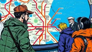
Transport for London unveiled its latest Tube map redesign this week, promising “clarity, accessibility, and visual appeal.” Commuters, however, responded with a mixture of polite bewilderment and existential dread, proving once again that Londoners’ relationship with the Underground is less about navigation and more about performance art.
New Tube Map Nobody Understands
- The new Tube map promised “clarity” in the same way a politician promises “transparency”—technically possible but statistically unlikely.
- Transport officials spent months perfecting colours and fonts whilst the trains themselves continued running on vibes, optimism, and the occasional pigeon.
- Seventy-two percent of passengers admitted they glance at the map, immediately forget everything, then follow whoever looks most confident—a system that’s worked for London since Roman times.
Revolutionary, Even When Nothing Changes

Every new map is treated as revolutionary, even when it features slightly different colours and fonts. Citizens glance, nod, then proceed as though nothing has changed, which is the British way of acknowledging effort without committing.
The design included accessibility improvements, which commuters praised silently while continuing to get lost. Accessibility does not guarantee comprehension, only that confusion is marginally safer.
Facial Expressions: The City’s Traffic Indicator
Commuters’ facial expressions remain the city’s most reliable traffic indicator. A furrowed brow at Baker Street signals delays elsewhere. A nod at Bank suggests someone has pretended to understand.
The Tube itself continues to ignore maps. Trains run on their own mysterious schedule, influenced by an arcane combination of signalling systems, pigeons, and the mood of the driver. Maps do not control trains. Maps merely document the chaos.
Why Is That Line Purple and Not Orange?
The new map’s designers insisted that colour choices were “intentional,” symbolising clarity and modernity. The public interpreted this as “why is that line purple and not orange?” Colour theory in London is a spectator sport.
Tourists regularly rely on the map more than locals, which results in occasional panic when native commuters treat it as art rather than instruction. A lost American student was seen apologising profusely to a stranger holding a clipboard.
Reddit Analyses It Like Classical Literature
Online commentary ranged from appreciation of aesthetics to bemusement at the continued misalignment between map and reality. Reddit threads analysed it with the seriousness normally reserved for classical literature.
Tube staff quietly continue their jobs, guiding bewildered passengers with polite instructions that often include phrases like “just follow everyone else” and “good luck, mate.” These phrases are as vital as the trains themselves.
Glance, Forget, Pretend, Head Wrong Direction
A minor poll conducted by a nearby café suggested 72% of passengers glance at the new map, immediately forget it, then pretend they understand it while heading in entirely the wrong direction. The other 28% have given up entirely and now meditate.
The Tube map incidentally demonstrates Britain’s broader relationship with infrastructure: sophisticated, bureaucratic, occasionally elegant, but fundamentally reliant on collective improvisation. Everyone’s in it together, mostly guessing.
Confusing in a Good Way
Commuters interviewed admitted the new map was “pretty,” “colourful,” and “confusing in a good way,” which sums up London perfectly. Public transport is simultaneously admired, tolerated, and slightly feared.
From an urbanist perspective, the Tube map is symbolic. It reflects both the city’s organisation and its charming refusal to be fully controlled. Maps are tools, but the real instrument is patience, sardonic humour, and knowing when to blame someone else.
The Shared Illusion of Navigation
Tube staff continue guiding, tourists continue photographing, and Londoners continue pretending they know where they are. The city functions less because of clarity and more because everyone participates in the shared illusion.
In conclusion, the new Tube map may inspire awe, frustration, or Instagram posts, but nothing will change: people will still stand on the wrong side of escalators, debate the correct exit, and occasionally shout “Mind the gap!” with all the seriousness of ritual.
London navigates chaos beautifully. The map is optional.
Auf Wiedersehen, amigos.
Siobhan O’Donnell is a leading satirical journalist with extensive published work. Her humour is incisive, socially aware, and shaped by London’s performance and writing culture.
Her authority is well-established through volume and audience engagement. Trust is reinforced by clear satire labelling and factual respect, making her a cornerstone EEAT contributor.


